Tuesday, January 28, 2014

Vintage Dinosaur Art: The Amazing World of Dinosaurs

The admirable effort of a single writer/illustrator, The Amazing World of Dinosaurs comes to us from the amazing world of 1981. It was a primitive age, when Donkey Kong was the cutting edge in video game entertainment, Bruce Dickinson had only just joined Iron Maiden, and popular palaeoart stood at an intriguing juncture. On the one hand, artists' work still owed much to the classic depictions of 'great fossil lizards', but there was nevertheless a conscious move towards more recognisably 'modern' restorations, spearheaded by the likes of John McLoughlin (who coined the phrase 'great fossil lizard' when referring to the outdated ideas he railed against). But I've said as much before. The Amazing World of Dinosaurs is interesting because it combines the old, the new, and the occasional foray into the bafflingly, spectacularly, book-crashingly wrong.


As writer/illustrator Terry Riley's hard work does deserve a doff of the cap, I'll get the wrongness out of the way first. A quick flip through this book will leave you with the impression that, while the content's pretty standard fare (a trip through the Mesozoic, stopping off to gawk at particularly big and odd-looking beasts along the way), Riley does basically know his stuff. As ever, closer inspection proves rewarding. Riley begins the book with a look at the earliest dinosaur discoveries which, according to him, were made by...Marry Anning.


For you see, in the world of Riley, ichthyosaurs are dinosaurs. As are plesiosaurs. And pterosaurs. Hence, the rather charming illustration of Little Miss Mary (above) is accompanied by the following facepalm-inducing text:
"The first complete skeleton of a dinosaur was found in 1811. The finder was a twelve-year-old British girl, Mary Anning, and the skeleton was that of an ichthyosaur...In later years, she found the first complete skeletons of two more dinosaurs, a plesiosaur and a pterodactyl."
While acknowledging new ideas on dinosaurian metabolism and lifestyles, Riley also falls foul of the contemporary fondness for Linnaean taxonomy:
"All dinosaurs were thought to be reptiles, which are cold-blooded animals. Then a complete fossilised pterosaur discovered in 1971 showed that these creatures were covered in fur. This means that pterosaurs were not, as previously thought, flying reptiles. Having fur, they must have been warm-blooded animals and therefore have belonged to a completely different group of animals that could fly."
But of course.


Such inaccuracies are particularly jarring as most of the book is carefully and thoughtfully written, and incorporates many relatively new discoveries (or at least, goes beyond the usual brontosaur/tyrannosaur/stegosaur triumvirate). Deinocheirus - the disembodied forelimb of which Riley illustrates alongside an especially dapper gentleman with Action Man hair - is such an inclusion, and one with a little topical resonance, I thought. Riley even goes as far as to describe birds as 'living dinosaurs', a notion scoffed at by some of the palaeontological 'old guard' at the time.


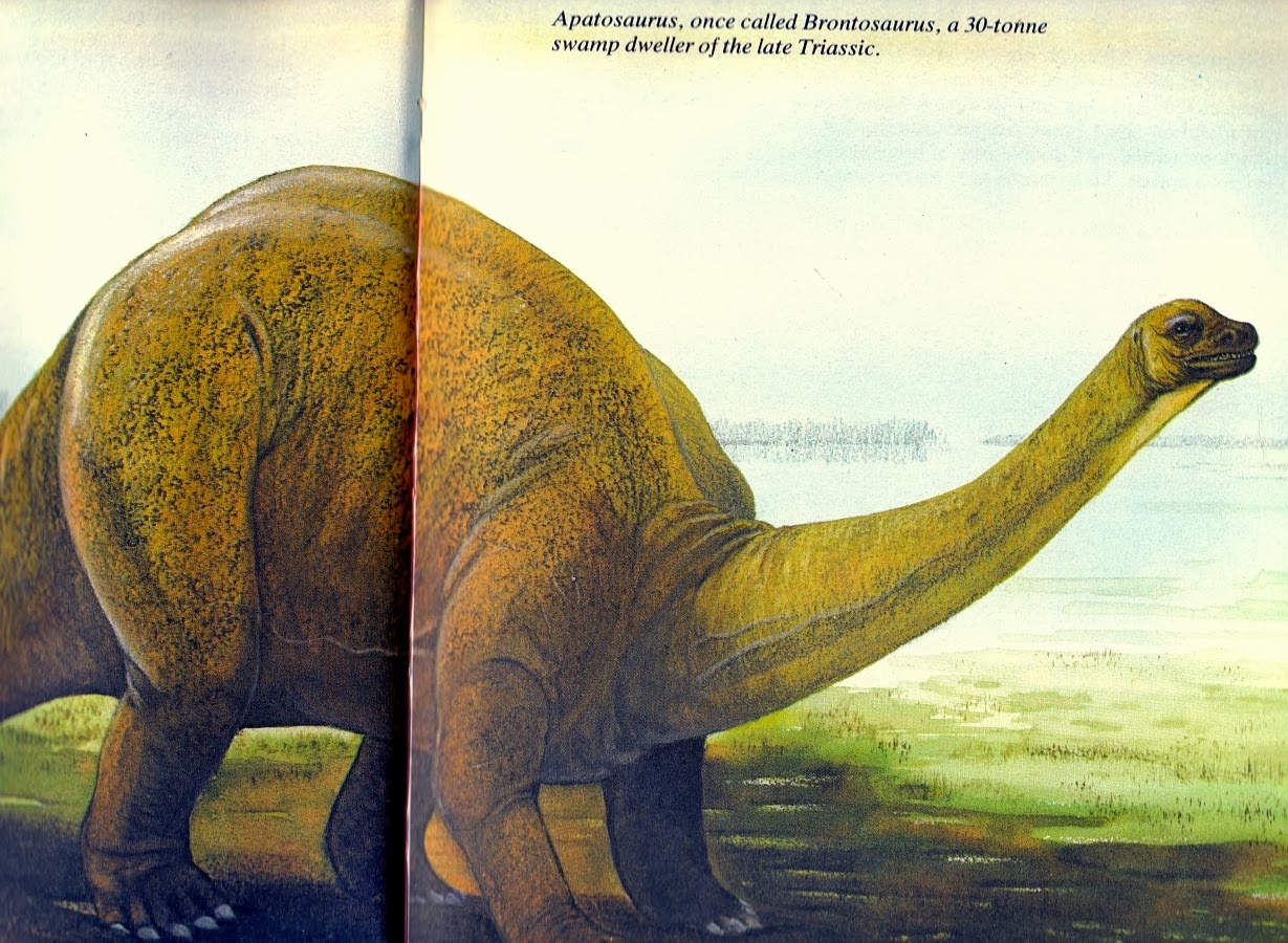
None of this is to say that the book doesn't have its fair share of outrageously retro bronto-blimps. Of course it bloody well does. Although depicted out on the shoreline, Riley's stodgy, stub-headed bronto is described as a "swamp dweller", and while Riley gains points for labelling the creature 'Apatosaurus', that "late Triassic" remark is unfortunate. I'm rather fond of the speckling on the beast's flanks, mind you. I shall name him Speckled Jim, a handsome and plump fellow.


By the same token, this ankylosaur (identified as "Ankylosaurus, or Euoplocephalus", because...meh) is very much of the old-fashioned, 'monstro armadillo louse' variety. I do enjoy Riley's penchant for a painterly, washy backdrop, which adds considerable charm to these pieces. I'll take vintage paintings like these over the latest execrable Pixel Shack abomination any day (GAG). Now if only I could persuade Dorling Kindersley likewise...


Occasionally, Riley's creations do stray from being conventionally retro, and start to look rather more...surreal. Such is the case with this Allosaurus, which appears to have suffered from a couple of ocular errors, namely

1. Size of eye does not account for scleral ring and surrounding tissue.
2. Eye is in the wrong hole.

Consequently, it looks a bit like John McLoughlin's attempt to restore Teratosaurus as a theropod dinosaur or alternatively, as Niroot would have it, a fish. A particularly sinister fish. Great pencil work, mind you. Why, if I could pencil that good, I wouldn't be sitting here with a glass of whisky, hammering out this load of old nonsense. I'd be flogging my super-artistic wares to enthusiastic publishers and collectors at fabulous prices. ('Cos that's how it works, right?)


Riley's Spinosaurus is somewhat more conventional-looking, but that of course means that it nevertheless looks bizarre by modern standards. There's something of a Neave Parker Megalosaurus air about it - the hunched posture, the tiny, grasping fingers, the perma-grumpy facial expression. It's just missing a discarded can being launched into the air by that right foot.


Sexy Rexy also appears quite Parkeresque, what with his upright posture and vacant stare, although the splayed legs have thankfully been ditched. The King, as he is known to his online fan community (although he died as the result of a cataclysmic asteroid strike, rather than on the throne), makes a rather more exciting appearance on the cover, which happily I haven't mentioned yet. Improbably fighting a Styracosaurus while cranking his neck around at an uncomfortable angle and receiving nasty scratches from the ceratopsian's frilly parts, Cover Rexy is nevertheless notable for his stunningly well-observed, highly birdlike feet. A minor victory for the McLoughlins of the world there, I think, and another one for the collection.


Riley's Deinonychus isn't especially birdlike, with its weedy muscles and slightly shonky head, but the inclusion of such animals in books like this did mark the beginning of a new era in popular depictions of dinosaurs. At least, when they weren't being shoehorned into the old 'reptilian sluggards' mould (which they aren't, in this case). Besides, such agile-looking depictions of smaller dinosaurs lead neatly to...


...Agile-looking depictions of really rather large dinosaurs. I really like this painting - mostly because it's a departure from the otherwise rather static 'great fossil lizards' that inhabit the rest of the book, admittedly, but also because there's a fantastic energy and dynamism about it. It's a worthy stab at depicting Triceratops as an exciting, fearsome animal, and from a tricky perspective, to boot (particularly in an age when multi-angle references weren't so easy to come by). The Battle Damage Frill is a nice touch, too. It may not be perfect, but it demonstrates that Riley could produce an attractive illustration or two, for all his cringeworthy taxonomic mishaps. And I do like to go out on a positive note. You know me...I'm lovely like that.

Next week: an album of teabag freebies!

Wednesday, January 22, 2014

Tetzoo Time


TetZoo Time logo by John Turmelle, via his DeviantArt gallery.

Thanks to Albertonykus and John Turmelle, there is now an Adventure Time/ Tetrapod Zoology Podcast mashup called TetZoo Time. It's just getting started, so this is the perfect time to hop aboard.

Darren Naish (of the absolutely essential Tetrapod Zoology blog) and John Conway (of the equally essential John Conway's artwork) have been turning out the TetZoo Podcast since February, having released episode 17 today. It's a fun listen, because how could Darren and John casually chatting about tetrapods living and extinct, movies, their publications for Irregular Books, and their various misadventures not be?

As for the TetZoo Time creative team, John Turmelle is also known as ClassicalGuy on DeviantArt and Albertonykus of the Raptormaniacs blog and comic have really nailed the Adventure Time style, including the painterly title cards at the beginning of Adventure Time episodes. The comic is full of little in-jokes for followers of Darren and John's individual work and the online paleontology community. This includes an absolutely perfect Ice King stand-in who will delight fanciers of heretical amateur paleontology.

Tuesday, January 21, 2014

Vintage Dinosaur Art: Dinosaurs and How They Lived - Part 2

Time for some more Fornari and Sergio (see also: part 1), and I think it would be pertinent to begin with what seems to be one of the most fondly-remembered illustrations from this book (based on Facebook comments) - an oversized Stegosaurus skeleton, swarming with diminutive museum workers.


It's obvious that the artist never believed that Stegosaurus was really this large - rather, it's a choice made for striking (and quite comic) effect, making liberal use of artistic license. This piece would appear to be one of Sergio's (although, again, no works are individually credited), and indeed the tiny people exhibit the wonderfully individualised and careful touches also seen in his 'sauropods in the city' illustration. The knowing smile of the woman in the foreground hints at the playful nature of this illustration - it's not to be taken too seriously, even if it is quite handy for showing the various techniques used to mount big dinosaur skeletons.


More serious is this illustration, by the same artist, of a dig site. Again, the human figures are wonderful, and it's possible to spend an enjoyable while picking out all the tiny details. However, I'm sure readers of this blog will be with me in their eyes being drawn to the (remarkably complete and articulated) skeleton in the centre, which seems to represent some gigantic new psittacosaurid. It'd probably end up being called Psittacotitan, or Megapsittacosaurus, or something equally lame. Of course, the idea of a gigantic Psittacosaurus-like beast swatting theropods and squishing cheeky mammals to a gooey mush, or maybe just fighting Rodan, is utterly fantastic - so I can hardly blame Sergio for his flight of fancy. In fact, should any readers care to illustrate such a scenario, I'd be more than happy to pack this book off to them. The glorious work of art that makes me laugh the most will surely win. Bonus points for inventing a brilliant scientific binomial for your implausible beast.


I'm pretty sure the 'dig site' painting appeared in Dinosaurs!, but I'm absolutely certain that this slightly off-putting Iguanodon-in-a-sleeping-bag illustration appeared just about everywhere (except Dinosaurs!, oddly enough) back in the '90s. There's something just ever-so-slightly wrong about it, which I'm going to put down to that strange skin texture - it looks more rubbery reptiloid alien than newly-hatched dino-sprog.


The eggy Iguanodon is unmistakably Fornari, and he also provides a number of illustrations of adult Iguanodon, some of which stretch over a number of pages - like this one, which begins on the contents pages, and tails off (hurr) during the foreword. The unusual skin texture reminds me of nothing so much as Normanpedia-era Sibbick, although Niroot has also compared it to Waterhouse Hawkins' Crystal Palace hulks. Beautifully painted, but rather strange. And shouldn't Iguanodon have a beak? The all-round lizardy lips add a touch of the retro.


At least Sergio can be relied upon to provide a much finer, altogether more dinosaurian scaly skin texture, even if his creations are rather derivative. The posture of this Deinonychus is lifted entirely from Bakker's famous illustration, but there's no denying that the carefully shaded skin folds and bulging muscles look fantastic. It has a pleasingly lifelike quality in spite of its scientific obsolescence, which is a significant achievement.


This, on the other hand, is just bloody shameless. Sergio did make the colour scheme considerably nattier, though, so I'll give him that. There's nothing quite like a dandy dinosaur, hence the popularity of illustrations in which monocled theropods where dapper period costume. Speaking of which...


...I am quite in love with this spread, and that's in spite of the fact that the Coelophysis is yet another obvious Sibbick knock-off. When one is required to present dinosaurs alongside human figures for size comparison purposes, why not indulge a little and dress them up in late Victorian outfits? (The humans, that is. Dressing up the saurians would be frowned upon in an educational book, although not by me.) Over on the Facebook page, Niroot dubbed this piece 'The Age of Plateosaurus Innocence,' and the Plateosaurus isn't so bad, even if it is quadrupedal (considered likely at the time) and a little overweight. Of course, I'm really just distracted by that darling hat and the elegance of the parasol. Swoon, etc.


To finish, may I present a particularly indulgent final course in the form of this Late Jurassic panorama by Sergio, featuring any number of both labelled and anonymous contemporaneous creatures. Some of the animals here - like the man-in-suit Ceratosaurus and 'armoured pasty' Stegosaurus - reach near Knightian (as in, Charles R) levels of palaeoart-retro (palaeoretro? Retralaeoart? I should probably stop). Others, like the Allosaurus, I really rather like, even if their heads have been tampered with - it's down to those lovely skin textures again, I think. In fact, the fine line detail evident in this piece is quite something to behold.


On the other side, we have a troop of straw-necked brontosaurs that look uncannily like the Invicta toy - down to the uniform grey colour - and yet another appearance of the 'How literal I am!' bird-grabbing Ornitholestes meme.The tiny add-on hands on the Archaeopteryx are unfortunate, but the feathers are quite lovely, if a little garish. It's always struck me as odd that artists have traditionally seen fit to deck out Archaeopteryx in such a flamboyant fashion. Perhaps it's 'cos scaly reptiles are always really boring shades of Elephantine Grey and Steaming Swampy Brown, while birds are inevitably so fabulously colourful that merely glancing at them induces crippling migraines, hence the need for twitchers to wear those protective visors. Yes, that'll be it.

Next week: something else entirely! But I can't leave Dinosaurs and How They Lived without mentioning that it's been an enjoyable book to review, and there is some quite fantastic artistic talent on show, for all the copycatting. I look forward to despatching it to one of our mad readers.

Friday, January 17, 2014

The Visual Effects of Walking With Dinosaurs

While Walking With Dinosaurs might have been an enormous disappointment, the consensus is that it's also an exceptionally pretty and well designed one. Unlike our intrepid reporters Mark and Niroot, I haven't seen it, partially because I didn't want to subject myself to it, and partially because I couldn't bring myself to subject someone else to it either.

That's why the video below, from Wired, is so cool: it gives us a look at the dinosaur designs with a minimum of inane, insulting chatter. There are some minor surprises as well; I had no idea that Parksosaurus and Hesperonychus were in the film. Obscure taxa in major studio releases are one of those things I feel like I ought to support.

Unless it means, say, sitting through Walking With Dinosaurs.


Monday, January 13, 2014

Vintage Dinosaur Art: Dinosaurs and How They Lived

Like so many books of its time, Dinosaurs and How They Lived is an intriguing hodge-podge of the old, the new, and the flagrantly copied. By 1988, the texts of books like these reflected (by and large) post-Dino Renaissance ideas of highly active and evolutionarily successful animals. Outside of top-flight palaeoartist circles, however, the art often leaned on the accomplished, but badly outdated work of '50s-'70s illustrators. And John Sibbick.


Two illustrators are credited for this book - Giuliano Fornari and 'Sergio'. Fornari has illustrated quite a number of dinosaur books aimed at children, and his animals have a very solid, stoic, reptilian look reminiscent of earlier Sibbick (sometimes rather, shall we say, uncannily so...but more on that later). Sergio's approach and style are rather different, and I'd love to know which of the many illustrators named 'Sergio' out there he happens to be. The cover appears to be a Sergio piece (although the book sadly doesn't credit individual works), and depicts some odd-looking dromaeosaurs (tiny hands, lizardy heads and all) hassling what appears to be a Maiasaura. There's much better stuff inside, but at least it's getting the 'dinosaurs were exciting' message across. I guess.


Perhaps the best example of old palaeoart memes meeting new discoveries is this Wealden panorama by Sergio, in which Baryonyx - still the hot new kid on the block at that time - encounters tail-dragging, upright Iguanodon and our old friend, the Tottering Anachronistic Megalosaur (TAM). Happily, the TAM is not only identified as Megalosaurus itself - a legacy of the use of the genus as a taxonomic dumping ground - it also boasts the weird, hunched posture that was obligatory for megalosaurs until the '90s, and probably has its origins in Neave Parker's work. The Iguanodon, for all their outdated tripodal posing, do at least look to be quite normal by contemporary standards. Or...do they?


There's something afoot with these loveable ornithopods. One individual, otherwise quite reminiscent of Sibbick's work in the Normanpedia, seems to have turned to a life of corpse-plundering carnivory. It's all worryingly reminiscent of the cover of Dinosaur Mysteries. Quite what inspired this strange turn isn't clear; there's no mention in the text of possible omnivory, and there are no other instances in the book of herbivores-gone-bad. Perhaps Sergio was just having a bit of fun...


Other Sergio panoramas include this one, showcasing that eternal rivalry. While evidently a proficient artist and illustrator - the fine line work on show is quite lovely - it seems that Sergio didn't really 'do' dinosaurs. The Triceratops look suspiciously Sibbickian, while the T. rex is cribbed from another source entirely. Although I can't for the life of me remember where/whom the original was from, those faithfully reproduced four forward-facing toes are very familiar.


A downside of having multiple illustrators work on a book like this is that the same species can end up looking quite radically different each time it's featured. Here we have Fornari's (I presume) take on T. rex, which is beautifully painted and not too bad for the time, save the rather odd skull, which we can probably put down to a lack of decent 3D references.


Rexy pops up again in a Sergio illustration depicting the groovy psychedelic lightshow of certain death at the end of the Mesozoic. Here, the animal takes on multiple different appearances in the same picture. While perspective problems are afoot, this does seem to be in part due to the different sources used - those in the middleground are based on illustrations by other artists, while the foreground individual is Sergio's take on a Dinamation robot.


What's there left to say about scenes like this? I mean, really. You open up any '80s or '90s kids' dinosaur book, and there's Tenontosaurus shrugging its shoulders as it's shredded to a bloody pulp by a ravening gang of Deinonychus land-piranha. This one (seemingly by Sergio) is quite reminiscent of William Stout's work, with plenty of blood and gore for the kids. Perhaps most striking about this illustration is the depiction of Tenontosaurus, which seems to marry Ely Kish's hauntingly skeletal head with Sibbick's tubbs-o-saurus body. I do appreciate the superb shading on the Deinonychus' meme-tastic neck wattles, though; someone should bring them back (although I guess Luis Rey sorta already did).


Trust 1980s sauropods to show up an illustrator's outdated reference material. Perhaps the worst offender here is the 'Apatosaurus' at right, a true 'brontosaur' complete with mismatched head, blimp-like body and paper-thin neck. (The brachiosaur, meanwhile, reminds me very much of Giovanni Caselli's work.) At the same time, this piece allows us to see the illustrator's true strengths. The background buildings are stunningly, intricately detailed (more than this scan would suggest), while the accompanying birds and pedestrians are invested in plenty of charm and tiny, individual touches - it's a shame I've had to cut most of them out (tiny scanner, see). There ain't no gettin' away from those ugly lardopods, though. Pity.


While the sauropod scene was handled by Sergio, most 'group shots' are illustrated by Fornari. They're quite gorgeous, but to anyone remotely familiar with the Normanpedia, most of them look exceedingly familiar. The Centrosaurus (with its peculiar nose-bulge) and Styracosaurus are near-direct Sibbick copies, while the Chasmosaurus sports an identical colour scheme, even if it's not quite a clone. Skin textures are often quite Sibbickian too, with the occasional sojourn to a finer level of pebbliness. Even if Fornari includes the notable enhancement of a partly-concealed gentleman in dapper costume, such copying deserves a dose of stern finger-wagging.


That said, some of Fornari's Sibbick-tracing can still be appreciated for its unintentionally amusing results. These hadrosaur heads are wonderfully painted, but their resemblance to those placed atop Sibbick's full body versions gives this illustration the air of a grim Mesozoic hunter's lodge. It's as if someone went out a-shootin' those three tonne conifer-munchin' varmints. It's duckbill season!

Next time: more of this sort of thing! There are a few fondly remembered illustrations in this book, mostly of skeletons, that I'd never be forgiven for not featuring. And so I will. Don't say I don't do you any favours.

Thursday, January 9, 2014

'Top hat' Deinonychus

Pencil and gouache on recycled paper, 95mm diameter.

Prompted by Marc�s comment on my New Year post, Deinonychus with a �top hat� feathery crest. I began fully intending to do a quick silly sketch, but it took a peculiarly serious turn.

(Note that the face isn't scaly but is skin with a pebbly, scale-like texture, akin to the faces of cormorants or the combs of fowl.)

Enjoy.
 

Tuesday, January 7, 2014

Vintageish Dinosaur Art: Dinosaur Worlds - Part 3

Although I've mostly focussed on the Steve Kirk spectaculars in Dinosaur Worlds so far, the supplementary illustrations (or "small featured creatures") definitely merit closer inspection. Many of them are the work of James Robins, a skilled and rather under-appreciated artist whose meticulous, often surprisingly prescient approach deserves praise aplenty.


Robins was one of the few artists working in the mid-'90s to depict theropod forelimbs in their correct 'neutral' position, as seen in the above Oviraptor (also shown below with a Big Red Button Tylocephale). There's even a small flap of skin akin to a patagium on the animal's forelimb. Just as with Wayne Barlowe's Oviraptor, the only reason this creation looks so jarringly wrong to us now, in a 'plucked chicken' sort of way, is that it is so good for its time. If you draw an oviraptorosaur honestly, based on as many references are as available to you, you won't be able to help but make it appear birdlike. It's a shame that mid-'90s (or perhaps, pre-Sinosauropteryx) conventions stopped Robins short of feathering the beast, but it's a lovely illustration nevertheless.


As proof that the Oviraptor wasn't simply a one-off, may I present this Liliensternus, complete with inward-facing palms (and vestigial digits, and speculative head crests). The strongly divergent 'thumbs' are a little odd-looking, but it's still a beauty; I love the alternating black and white bands on the tail.


Robins also turns his hand to non-dinosaurian archosaurs, and the results are really rather cool, if sometimes a little unusual. His take on a generic rauisuchian (or 'rausuchian', as the caption would have it) is uncommonly sleek and 'Paulian' - in that it resembles Paul's theropods - for a restoration of such an animal. Whatever one might think of it (and it probably could do with a few more osteoderms), it's certainly an interesting break from convention, and quite thought-provoking in that applies an artistic style normally restricted to dinosaurs to another archosaur clade. Rauisuchians certainly did display a few interesting anatomical convergences with theropod dinosaurs, in spite of being distantly related (insert Teratosaurus reference here).


Robins' Sarcosuchus is, as one might expect, rather more traditional. It might not have literally been a dirty great crocodile, but it certainly would have resembled one in life - to anyone viewing it from a reasonably safe distance, anyway. This is an excellently painted illustration that manages to exude menace - and more than that, personality - in spite of its 'diagnostic' purpose.


Excellent as Robins' pieces are, they don't constitute every non-Kirk illustration in Dinosaur Worlds. Unfortunately. Additional illustrations are credited to James Field, although the style of the illustrations seems to vary so much that it's hard to believe he was behind all of them. I mean, some of them are actually rather accomplished (like the cover), whereas others feature three-fingered tyrannosaurs haphazardly based on Dinamation robots.


Oh boy. BLOOD! GUTS! CERATOPSIAGEDDON! SUPERFLUOUS MANUAL DIGITS! Not to mention a landscape devoid of any vegetation whatsoever. The centrosaurs look rather familiar, too, particularly with that skin texture - but don't ask me where they came from. Hopefully, I'll end up buying the book featuring the originals for a pittance on eBay. It's what tends to happen.


Elsewhere, the same artist rather derails a series of theropod portraits that are intended to show off the animals' unusual facial adornments - by giving Allosaurus a Monitor Lizard Face in true retro-Zallingerian fashion, rather than the adorable lacrimal hornlets it surely should have. Note also the slightly-wrong-crested Monolophosaurus (an early appearance for this dinosaur in a children's book), alongside "OH HAI!" Carnotaurus. Since the artist had at least some recourse to skeletal references - given the other heads on show here - it's surprising that Allosaurus should end up hornless.


Rather less surprising is that poor old Archaeopteryx receives yet another pretty dreadful portrait to add to the ever-growing heap. The plumage on this one doesn't so much resemble feathers as fishlike scales on a Chinese dragon; note also that, as the artist was presumably copying from a single source, the animal is inevitably shown with its wings outstretched. It does help make the 'sinking' picture unintentionally amusing (it's swimming, surely? I mean, you can almost hear the appropriate soundtrack). Worth contrasting with Kirk's from the same book, I think.


Still, I'd hate to go out on a downer, so here's another Robins - this time, taking a peek under the skin of Tyrannosaurus (in similar fashion to his previously featured Plateosaurus). Again, I'd hate to comment on the arrangement of the various internal organs, but the skeleton looks pretty damn good for 1996 - I'm sure those neutrally positioned forelimbs help. Robins certainly knows his stuff, and I'd love to see some of his more recent work - for whatever reason, it's been eluding me these last few years. If anyone can help me find some latter day Robins, I'd be very grateful. For I am astonishingly lazy.

Next week: something else! Hopefully. I seem to be spending my entire life filling in forms at the moment. But I'll try.

Monday, January 6, 2014

Happy New Year

Sepia ink and gouache on grey toned Strathmore paper, 144mm diameter. Image can be opened in a new tab for full view.


Not as prompt as I would have wished (prompt, me? The very idea...), but Epiphany is still a good time to wish all of our readers a very happy 2014 from the Chasmosaurs team. Regular readers will already be familiar with the four saurian portraits of the blog authors, but should you need a reminder, you may like to revisit last year's New Year greeting.

Happy New Year!


Friday, January 3, 2014

Stegodimetrodon

It's not a centerpiece of the city's public art, but one park in Bloomington, Indiana does boast a "dinosaur" sculpture of its very own. Traveling out of your way to see it may not be advisable, but's certainly worth a look if you're in the area. It may be your only chance to see a Dimetrodon with a thagomizer.

Bryan Park Dimetrodon

Bryan Park Dimetrodon

The parks department has helpfully erected an informational plaque next to the bench, identifying the carver as William Galloway, who created the piece in 1989, when it won the Hoosierfest Limestone Bench Carving Contest. I was happy to see that the bench's weirdness is acknowledged, though it's not fully explained:
Originally, the sculpture was meant to be carved in the shape of a Stegosaurus, but since Stegosaurus don't have sail-backs, the artist chose Dimetrodon so people would have a place to lean their backs. Not wanting to give up the large loop on the bench, a Stegosaurus tail was added, making this bench a hybrid dinosaur of sorts.
I'd guess that the design changed before carving ever began, with the spiky tail the only part of the original sketches to be retained. Call it artistic license. The plaque does explain that Dimetrodon was not a dinosaur, which is great, but it's a bit muddled on evolutionary history, noting that "dinosaurs eventually evolved into modern day reptiles and birds" and that Dimetrodon is "actually an early ancestor of modern day mammals." A few points for effort, I suppose.

Update 1/6/13: Meant to include that this is, as indiated in comment by Mark Robinson, in Bloomington's Bryan Park. It's a real nice park.

top social