Over the years of writing these blog posts, I'd like to think that I've matured somewhat - that the vodka-fuelled gratuity of my late university years has mellowed into something more thoughtful and, dare I say it, nuanced. (Oh yes. I went there.) Sure, I'll still point out shonky dinosaur art, but with less savagery, and an acknowledgement that, by contemporary standards, it's often not so bad. Plus, illustrators gotta eat.
On the other hand, one is occasionally reminded that a few - a very few - palaeoartists over the years managed to make their jobbing contemporaries' work look more than a little embarrassing - maybe, even, deserving of the occasional pouring of scorn. One of those artists is James Robins.
While we've looked at Robins' work here before, I think it's always worth revisiting him. As an illustrator of dinosaur books, Robins often gets overlooked historically in favour of palaeoart's Big Names. This is a pity, because Robins' work was often well ahead of the curve, especially in the early '90s. The worst palaeoart tropes of the previous decades were on the way out, but still lingered in every tail-dragging, rotund sauropod, freakish, dainty-handed dromaeosaur, and nonspecific tyrannosaur with zipper teeth. Robins' work stands out because, damn it, he actually paid attention to anatomical references. His highly precise approach contrasts sharply with Rothman's rather more, er, old-fashioned style - it might not quite be Ankylosaurus by modern standards, but that's still a pretty stylish-looking beast (above).
His Tenontosaurus, too, is far sleeker and more sprightly-looking than early '90s audiences were probably used to, especially since Sibbick's '80s version (from his endlessly copied illustrations for the Normanpedia) was far weightier and stodgier-looking, dragged tail and all. It also appears devoid of dromaeosaur hitchhikers...which is nice. The goat-like pupils are another neat touch, and harken back to the work of John McLoughlin.
If there's one unfortunate aspect of Robins' work for the AMNH book, it's that it's - typically for him - confined to 'spotter's guide'-type illustrations of animals against plain white backgrounds. Robins is perfectly capable of painting landscapes, but it seems that he was more often commissioned to produce this more diagrammatical work. But I'm grateful for what I can get. Robins' Protoceratops (above) is remarkable for the early '90s, an age when the animal tended to be stuck in a semi-sprawling 1970s timewarp.
Sadly, there aren't too many Robins theropods in the AMNH book; in addition to the excellent Oviraptor featured in the last post, we're also given this Coelophysis pair. Again, it's commendable for its fine details (down to the vestigial fingers) and overall modern look. Coelophysis often didn't fare too well in the early '90s - I'm still haunted by the freakish illustrations that appeared in Dinosaurs! The Jurassic Park toys were cool, though. Pipe-cleaner-o-saurus!
To compensate for the lack of theropods, we are granted an unusually diverse selection of Robins non-dinosaurs. For starters, here's the gharial-like phytosaur Rutiodon decked out in a very fetching stripy brick red colour scheme...
...Followed by the ichthyosaur Stenopterygius, famous for carelessly allowing its very new-not-quite-born babies to become hopelessly killed and fossilised. While not terribly exciting, it's a pleasing enough piece; Robins' penchant for fine line work is put to good effect. I like the red eye, too. It falls on the right side of the 'striking and reptilian/Halloween monster' divide.
His Eurhinodelphis is more monstrous-looking, but it's not Robins' fault - the creature really did have a nose like that. Ridiculous. That dappled light is quite lovely, though. Noteworthy here is the speculative incipient dorsal fin, which Robins illustrates with a rather unusual 'plateau' shape.
But never mind all that - how many readers had no idea that Robins did prehistoric mammals? Me too! It's always a pleasant surprise to learn that an artist's prehistoric animal repertoire is wider than you imagined. Quite few people seem to realise that, for example, Luis Rey does prehistoric mammals, too - and rather well. (And no, they're not brightly coloured).
And with that...ancient alpacas! Now there's a series for you, History Channel. Alien camelids descending on the earliest human civilisations, helping them construct the pyramids, the great Aztec cities, Atlantis, etc. etc., before getting grumpy, spitting at the poxy monkeys and zipping back off into space? Fantastic. It would also explain how camelids had such a significant role in the development of advanced civilisations in both Africa and the Americas (because they did, you know) THINK ABOUT IT.
What I meant to say was: here's Robins' illustration of the early camelid Stenomylus. It's an animal that seldom appears in popular dinosaur andotherprehistoricanimal books, perhaps due to its lack of large teeth, claws, size, or other sexy attributes. It was a wee camelid that lived in North America, lacked some features of modern camelids, and that's about it. But hey, Robins does a nice job - love those stripy pelts and (at the risk of flogging a dead camelid) superb small details. Stenomylus - and Robins - take a bow.
Next week - Doctor Who! No, not Peter Capaldi (well, maybe Peter Capaldi), but a 1976 book featuring dinosaurs and occasionally uncanny depictions of Tom Baker. I can't wait to share it.
Showing posts with label James Robins. Show all posts
Tuesday, August 19, 2014
Wednesday, August 6, 2014
Vintage Dinosaur Art: The American Museum of Natural History's Book of Dinosaurs
Meeting our Vintage Dinosaur Art criterion by the slimmest of margins, The American Museum of Natural History's Book of Dinosaurs and Other Ancient Creatures (snappier titles are there none) is a mere twenty years old. However - and as I've said numerous times before - it's amazing how much has changed since the early '90s, even when it comes to restorations of dinosaurs that aren't (yet) known to have been feathered. The AMNH book (as I'm sure you won't mind me calling it) is also notable for featuring artists with differing approaches and styles, which only adds further historical interest. Some of our old friends are in there, but there's at least one highly notable contributor who hasn't been featured in a VDA post before...which always makes me So Very Happy.
Perhaps most prominent among the illustrators for this book - if for no other reason than his work appears on the cover (at least, of the edition I have) - is Michael Rothman. Rothman's work is quite vibrant, with an emphasis on lush greenery that lends his best pieces a quite naturalistic feel. In fact, his plants and landscapes are frequently better than his dinosaurs, which are afflicted by a few contemporaneous palaeoart tropes. But more on that shortly.
Rothman's style also occasionally gives his paintings the air of much earlier, Burian-era palaeoart, which I certainly don't object to. There's something rather stately and solid about them, and this particularly applies to the above sepia-tinged scene, in which a brachiosaur adult and juvenile are harassed by a gang of allosaurs, while other Late Jurassic denizens look on. Such are the changing trends even in the artistic styles of palaeoart - never mind the depiction of the animals themselves - that this piece looks much older than it really is at first glance, and it takes the relatively svelte animals to remind us that we're looking at a post-Dino Renaissance work. Of course, there's much that's still just Plain Retro from our standpoint. Perhaps most notably, there's that manifestation of the peculiar notion that sauropod necks were like squishy octopus tentacles with a perma-grinning mug glued to one end. Bones? Where we're going, we won't need bones!
In addition to a certain painterly (shot!) loveliness, Rothman's work also quite clearly exhibits influences from the most prominent palaeoartists of the period, including John Gurche and Mark Hallett. This is nowhere more evident than in the skin textures of the animals he paints; they have a certain leatheriness that seems evocative of Gurche in particular. While the above illustration appears to be an attempt to cram absolutely every early '90s palaeoart trope into one image (naked dromaeosaurs being badasseses! Motherly ornithopods! Noodle-necked elephantine-skinned brachiosaurs! Big armed ol' T. rex with Hallett-o-horns!), it's likely to be a deliberate 'montage' of different animals. In the book, it precedes a chapter that takes a look at the diversity of dinosaurs (andotherancientcreatures). All the same, it's a fun encapsulation of early '90s attitudes - the rather Gurche-esque dromaeosaur in particular. Spot what appears to be a sauropod looking back over its shoulder in the top left - like a less barmy version of the Invicta Mamenchisaurus.
Rothman's cover illustrations are also featured inside the book at a larger size, all the better for a more thorough appreciation. His rather sad and melty-looking brown Apatosaurus reminds me a great deal of Sibbick's work, although that's probably because that's what I grew up with - Sibbick himself borrowed from Hallett back in the '80s. The rather emaciated - dessicated, even - head contrasts with the more rotund (although not overly so) body, while the neck lacks that characteristic apatosaurian extreme width. In fact, it almost seems to become a ribbon at one point. While serviceable as an illustration of a brown sauropod for a museum dinosaur book, this is perhaps the best example of where Rothman's skill at depicting flora comes to the fore. There's a pleasing realism to the splintered pines, and he puts them to good use in the composition. One should never underestimate how much decent scenery adds to the believability of palaeoart.
The power of a well-painted backdrop is nowhere more evident that in both the theatre, and in depictions of Triceratops totally bloodily goring Tyrannosaurus just below the knee. This gently sloping forestscape is just wonderful, although the positioning of the animals here is a little peculiar - like Rexy was just minding his own business, taking a stroll through the forest, when a mad Triceratops barged its way through and slashed his knee. The restoration of the animals isn't too shabby for the time, although Rexy's (again) rather oversized arms are curious, and the splayed hand pointing directly at the viewer reminds me of nothing so much as a certain famous First World War propaganda sheet (American readers might be more familiar with an Uncle Sam-featuring copycat).
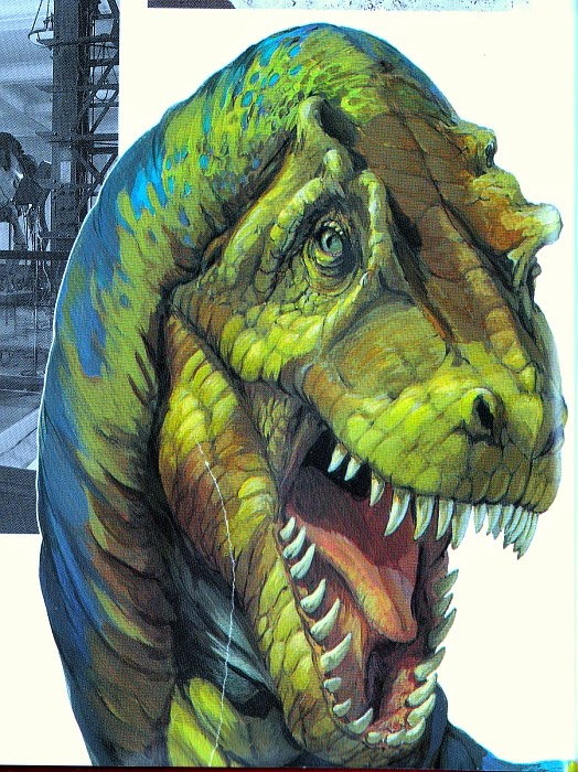
A few of Rothman's dinosaurs appear shorn of backgrounds, and they don't hold up nearly as well today. This slightly Stoutian Rexy isn't the worst ever, but is inferior to the one featured in the scene with Triceratops; it suffers from a slightly disproportionate and bony fizzog with enormous, plate-like scales. (Is it just me, or is that a rather coy expression? You alarming devil, Sexy Rexy, you.)
Rothman provides further 'profile' or 'diagnostic' illustrations for the book's 'Gallery of Dinosaurs' (andotherancientcreatures). Contrary to his crocodilian-faced Rexy, they often appear to be largely devoid of dinosaurian scales, instead sporting highly wrinkled, leathery skin. By and large, they are very reminiscent of Sibbick's work for the Normanpedia, although the animals are a little less shapeless in appearance. When compared with Sibbick's lumbering giant theropods, Rothman's Albertosaurus (above) appears very sprightly and agile.
Perhaps most Sibbickesque in appearance is Rothman's Edmontosaurus (in style only; it's not a copy of Sibbick's). Or at least, its back end is - the vintage Sibbick-style Michelin Man skin texture blends into finer scales towards the frond of the animal. Although dated now, there is a pleasing chunky solidity to it - even devoid of context, the creature appears physically massive and heavy, without being overly bloated.
But what of the other artists? Well, I'm happy to report that James Robins has a decent amount of work featured in this book, which I might just have to feature in a post all on its own. His clean, unfussy, and highly modern style contrasts markedly with Rothman's more traditional approach while, as ever, his Paulian maniraptors look as startlingly 'plucked' as they should. His Oviraptor (above) is superb for its time, but Robins' depictions of this dinosaur would become still more prescient in the immediately following years...even if they remained featherless.
And speaking of feathers...unusually, Archaeopteryx is not alone in sporting full-on birdy plumage in the AMNH book - Mononykus does too! Ah, but that's only because it was believed by some authorities at the time to have definitively been a bird (as in, an avialan bird) - not least co-describer Mark Norrell, who in the AMNH book describes how he and his colleagues initially believed the animal to be a non-avian dinosaur, before realising that they'd 'dug up a bird'. As a result, Mononykus is one of the few non-avian theropods discovered prior to 1996 that it's difficult to find an unfeathered illustration of (alongside Avimimus).* The book's illustration (above) - by, you guessed it, Rothman - is quite a treat, and in many respects ahead of its time in depicting a non-avian theropod with such advanced, complex feathers...even if they did think it was a 'proper' bird back then. (Whatever that even means anymore.) It's a lovely piece, with the lighting on the animal's fluffy feather coat being particularly noteworthy. Arguably, it also avoids making the animal look like some sort of monstrous 'lizard-bird', instead presenting a creature that seems of a piece - more than a lot of artists can manage today. A lesson in painting feathered dinosaurs from 1993 - not what I was expecting when I first opened this book!
*Oh, but I did find one. Thank you, Google image search.
Perhaps most prominent among the illustrators for this book - if for no other reason than his work appears on the cover (at least, of the edition I have) - is Michael Rothman. Rothman's work is quite vibrant, with an emphasis on lush greenery that lends his best pieces a quite naturalistic feel. In fact, his plants and landscapes are frequently better than his dinosaurs, which are afflicted by a few contemporaneous palaeoart tropes. But more on that shortly.
![]() |
| With apologies for the dreadful scan. |
In addition to a certain painterly (shot!) loveliness, Rothman's work also quite clearly exhibits influences from the most prominent palaeoartists of the period, including John Gurche and Mark Hallett. This is nowhere more evident than in the skin textures of the animals he paints; they have a certain leatheriness that seems evocative of Gurche in particular. While the above illustration appears to be an attempt to cram absolutely every early '90s palaeoart trope into one image (naked dromaeosaurs being badasseses! Motherly ornithopods! Noodle-necked elephantine-skinned brachiosaurs! Big armed ol' T. rex with Hallett-o-horns!), it's likely to be a deliberate 'montage' of different animals. In the book, it precedes a chapter that takes a look at the diversity of dinosaurs (andotherancientcreatures). All the same, it's a fun encapsulation of early '90s attitudes - the rather Gurche-esque dromaeosaur in particular. Spot what appears to be a sauropod looking back over its shoulder in the top left - like a less barmy version of the Invicta Mamenchisaurus.
Rothman's cover illustrations are also featured inside the book at a larger size, all the better for a more thorough appreciation. His rather sad and melty-looking brown Apatosaurus reminds me a great deal of Sibbick's work, although that's probably because that's what I grew up with - Sibbick himself borrowed from Hallett back in the '80s. The rather emaciated - dessicated, even - head contrasts with the more rotund (although not overly so) body, while the neck lacks that characteristic apatosaurian extreme width. In fact, it almost seems to become a ribbon at one point. While serviceable as an illustration of a brown sauropod for a museum dinosaur book, this is perhaps the best example of where Rothman's skill at depicting flora comes to the fore. There's a pleasing realism to the splintered pines, and he puts them to good use in the composition. One should never underestimate how much decent scenery adds to the believability of palaeoart.
The power of a well-painted backdrop is nowhere more evident that in both the theatre, and in depictions of Triceratops totally bloodily goring Tyrannosaurus just below the knee. This gently sloping forestscape is just wonderful, although the positioning of the animals here is a little peculiar - like Rexy was just minding his own business, taking a stroll through the forest, when a mad Triceratops barged its way through and slashed his knee. The restoration of the animals isn't too shabby for the time, although Rexy's (again) rather oversized arms are curious, and the splayed hand pointing directly at the viewer reminds me of nothing so much as a certain famous First World War propaganda sheet (American readers might be more familiar with an Uncle Sam-featuring copycat).
A few of Rothman's dinosaurs appear shorn of backgrounds, and they don't hold up nearly as well today. This slightly Stoutian Rexy isn't the worst ever, but is inferior to the one featured in the scene with Triceratops; it suffers from a slightly disproportionate and bony fizzog with enormous, plate-like scales. (Is it just me, or is that a rather coy expression? You alarming devil, Sexy Rexy, you.)
Rothman provides further 'profile' or 'diagnostic' illustrations for the book's 'Gallery of Dinosaurs' (andotherancientcreatures). Contrary to his crocodilian-faced Rexy, they often appear to be largely devoid of dinosaurian scales, instead sporting highly wrinkled, leathery skin. By and large, they are very reminiscent of Sibbick's work for the Normanpedia, although the animals are a little less shapeless in appearance. When compared with Sibbick's lumbering giant theropods, Rothman's Albertosaurus (above) appears very sprightly and agile.
Perhaps most Sibbickesque in appearance is Rothman's Edmontosaurus (in style only; it's not a copy of Sibbick's). Or at least, its back end is - the vintage Sibbick-style Michelin Man skin texture blends into finer scales towards the frond of the animal. Although dated now, there is a pleasing chunky solidity to it - even devoid of context, the creature appears physically massive and heavy, without being overly bloated.
But what of the other artists? Well, I'm happy to report that James Robins has a decent amount of work featured in this book, which I might just have to feature in a post all on its own. His clean, unfussy, and highly modern style contrasts markedly with Rothman's more traditional approach while, as ever, his Paulian maniraptors look as startlingly 'plucked' as they should. His Oviraptor (above) is superb for its time, but Robins' depictions of this dinosaur would become still more prescient in the immediately following years...even if they remained featherless.
And speaking of feathers...unusually, Archaeopteryx is not alone in sporting full-on birdy plumage in the AMNH book - Mononykus does too! Ah, but that's only because it was believed by some authorities at the time to have definitively been a bird (as in, an avialan bird) - not least co-describer Mark Norrell, who in the AMNH book describes how he and his colleagues initially believed the animal to be a non-avian dinosaur, before realising that they'd 'dug up a bird'. As a result, Mononykus is one of the few non-avian theropods discovered prior to 1996 that it's difficult to find an unfeathered illustration of (alongside Avimimus).* The book's illustration (above) - by, you guessed it, Rothman - is quite a treat, and in many respects ahead of its time in depicting a non-avian theropod with such advanced, complex feathers...even if they did think it was a 'proper' bird back then. (Whatever that even means anymore.) It's a lovely piece, with the lighting on the animal's fluffy feather coat being particularly noteworthy. Arguably, it also avoids making the animal look like some sort of monstrous 'lizard-bird', instead presenting a creature that seems of a piece - more than a lot of artists can manage today. A lesson in painting feathered dinosaurs from 1993 - not what I was expecting when I first opened this book!
*Oh, but I did find one. Thank you, Google image search.
Tuesday, January 7, 2014
Vintageish Dinosaur Art: Dinosaur Worlds - Part 3
Although I've mostly focussed on the Steve Kirk spectaculars in Dinosaur Worlds so far, the supplementary illustrations (or "small featured creatures") definitely merit closer inspection. Many of them are the work of James Robins, a skilled and rather under-appreciated artist whose meticulous, often surprisingly prescient approach deserves praise aplenty.
Robins was one of the few artists working in the mid-'90s to depict theropod forelimbs in their correct 'neutral' position, as seen in the above Oviraptor (also shown below with a Big Red Button Tylocephale). There's even a small flap of skin akin to a patagium on the animal's forelimb. Just as with Wayne Barlowe's Oviraptor, the only reason this creation looks so jarringly wrong to us now, in a 'plucked chicken' sort of way, is that it is so good for its time. If you draw an oviraptorosaur honestly, based on as many references are as available to you, you won't be able to help but make it appear birdlike. It's a shame that mid-'90s (or perhaps, pre-Sinosauropteryx) conventions stopped Robins short of feathering the beast, but it's a lovely illustration nevertheless.
As proof that the Oviraptor wasn't simply a one-off, may I present this Liliensternus, complete with inward-facing palms (and vestigial digits, and speculative head crests). The strongly divergent 'thumbs' are a little odd-looking, but it's still a beauty; I love the alternating black and white bands on the tail.
Robins also turns his hand to non-dinosaurian archosaurs, and the results are really rather cool, if sometimes a little unusual. His take on a generic rauisuchian (or 'rausuchian', as the caption would have it) is uncommonly sleek and 'Paulian' - in that it resembles Paul's theropods - for a restoration of such an animal. Whatever one might think of it (and it probably could do with a few more osteoderms), it's certainly an interesting break from convention, and quite thought-provoking in that applies an artistic style normally restricted to dinosaurs to another archosaur clade. Rauisuchians certainly did display a few interesting anatomical convergences with theropod dinosaurs, in spite of being distantly related (insert Teratosaurus reference here).
Robins' Sarcosuchus is, as one might expect, rather more traditional. It might not have literally been a dirty great crocodile, but it certainly would have resembled one in life - to anyone viewing it from a reasonably safe distance, anyway. This is an excellently painted illustration that manages to exude menace - and more than that, personality - in spite of its 'diagnostic' purpose.
Excellent as Robins' pieces are, they don't constitute every non-Kirk illustration in Dinosaur Worlds. Unfortunately. Additional illustrations are credited to James Field, although the style of the illustrations seems to vary so much that it's hard to believe he was behind all of them. I mean, some of them are actually rather accomplished (like the cover), whereas others feature three-fingered tyrannosaurs haphazardly based on Dinamation robots.
Oh boy. BLOOD! GUTS! CERATOPSIAGEDDON! SUPERFLUOUS MANUAL DIGITS! Not to mention a landscape devoid of any vegetation whatsoever. The centrosaurs look rather familiar, too, particularly with that skin texture - but don't ask me where they came from. Hopefully, I'll end up buying the book featuring the originals for a pittance on eBay. It's what tends to happen.
Elsewhere, the same artist rather derails a series of theropod portraits that are intended to show off the animals' unusual facial adornments - by giving Allosaurus a Monitor Lizard Face in true retro-Zallingerian fashion, rather than the adorable lacrimal hornlets it surely should have. Note also the slightly-wrong-crested Monolophosaurus (an early appearance for this dinosaur in a children's book), alongside "OH HAI!" Carnotaurus. Since the artist had at least some recourse to skeletal references - given the other heads on show here - it's surprising that Allosaurus should end up hornless.
Rather less surprising is that poor old Archaeopteryx receives yet another pretty dreadful portrait to add to the ever-growing heap. The plumage on this one doesn't so much resemble feathers as fishlike scales on a Chinese dragon; note also that, as the artist was presumably copying from a single source, the animal is inevitably shown with its wings outstretched. It does help make the 'sinking' picture unintentionally amusing (it's swimming, surely? I mean, you can almost hear the appropriate soundtrack). Worth contrasting with Kirk's from the same book, I think.
Still, I'd hate to go out on a downer, so here's another Robins - this time, taking a peek under the skin of Tyrannosaurus (in similar fashion to his previously featured Plateosaurus). Again, I'd hate to comment on the arrangement of the various internal organs, but the skeleton looks pretty damn good for 1996 - I'm sure those neutrally positioned forelimbs help. Robins certainly knows his stuff, and I'd love to see some of his more recent work - for whatever reason, it's been eluding me these last few years. If anyone can help me find some latter day Robins, I'd be very grateful. For I am astonishingly lazy.
Next week: something else! Hopefully. I seem to be spending my entire life filling in forms at the moment. But I'll try.
Robins was one of the few artists working in the mid-'90s to depict theropod forelimbs in their correct 'neutral' position, as seen in the above Oviraptor (also shown below with a Big Red Button Tylocephale). There's even a small flap of skin akin to a patagium on the animal's forelimb. Just as with Wayne Barlowe's Oviraptor, the only reason this creation looks so jarringly wrong to us now, in a 'plucked chicken' sort of way, is that it is so good for its time. If you draw an oviraptorosaur honestly, based on as many references are as available to you, you won't be able to help but make it appear birdlike. It's a shame that mid-'90s (or perhaps, pre-Sinosauropteryx) conventions stopped Robins short of feathering the beast, but it's a lovely illustration nevertheless.
As proof that the Oviraptor wasn't simply a one-off, may I present this Liliensternus, complete with inward-facing palms (and vestigial digits, and speculative head crests). The strongly divergent 'thumbs' are a little odd-looking, but it's still a beauty; I love the alternating black and white bands on the tail.
Robins also turns his hand to non-dinosaurian archosaurs, and the results are really rather cool, if sometimes a little unusual. His take on a generic rauisuchian (or 'rausuchian', as the caption would have it) is uncommonly sleek and 'Paulian' - in that it resembles Paul's theropods - for a restoration of such an animal. Whatever one might think of it (and it probably could do with a few more osteoderms), it's certainly an interesting break from convention, and quite thought-provoking in that applies an artistic style normally restricted to dinosaurs to another archosaur clade. Rauisuchians certainly did display a few interesting anatomical convergences with theropod dinosaurs, in spite of being distantly related (insert Teratosaurus reference here).
Robins' Sarcosuchus is, as one might expect, rather more traditional. It might not have literally been a dirty great crocodile, but it certainly would have resembled one in life - to anyone viewing it from a reasonably safe distance, anyway. This is an excellently painted illustration that manages to exude menace - and more than that, personality - in spite of its 'diagnostic' purpose.
Excellent as Robins' pieces are, they don't constitute every non-Kirk illustration in Dinosaur Worlds. Unfortunately. Additional illustrations are credited to James Field, although the style of the illustrations seems to vary so much that it's hard to believe he was behind all of them. I mean, some of them are actually rather accomplished (like the cover), whereas others feature three-fingered tyrannosaurs haphazardly based on Dinamation robots.
Oh boy. BLOOD! GUTS! CERATOPSIAGEDDON! SUPERFLUOUS MANUAL DIGITS! Not to mention a landscape devoid of any vegetation whatsoever. The centrosaurs look rather familiar, too, particularly with that skin texture - but don't ask me where they came from. Hopefully, I'll end up buying the book featuring the originals for a pittance on eBay. It's what tends to happen.
Elsewhere, the same artist rather derails a series of theropod portraits that are intended to show off the animals' unusual facial adornments - by giving Allosaurus a Monitor Lizard Face in true retro-Zallingerian fashion, rather than the adorable lacrimal hornlets it surely should have. Note also the slightly-wrong-crested Monolophosaurus (an early appearance for this dinosaur in a children's book), alongside "OH HAI!" Carnotaurus. Since the artist had at least some recourse to skeletal references - given the other heads on show here - it's surprising that Allosaurus should end up hornless.
Rather less surprising is that poor old Archaeopteryx receives yet another pretty dreadful portrait to add to the ever-growing heap. The plumage on this one doesn't so much resemble feathers as fishlike scales on a Chinese dragon; note also that, as the artist was presumably copying from a single source, the animal is inevitably shown with its wings outstretched. It does help make the 'sinking' picture unintentionally amusing (it's swimming, surely? I mean, you can almost hear the appropriate soundtrack). Worth contrasting with Kirk's from the same book, I think.
Still, I'd hate to go out on a downer, so here's another Robins - this time, taking a peek under the skin of Tyrannosaurus (in similar fashion to his previously featured Plateosaurus). Again, I'd hate to comment on the arrangement of the various internal organs, but the skeleton looks pretty damn good for 1996 - I'm sure those neutrally positioned forelimbs help. Robins certainly knows his stuff, and I'd love to see some of his more recent work - for whatever reason, it's been eluding me these last few years. If anyone can help me find some latter day Robins, I'd be very grateful. For I am astonishingly lazy.
Next week: something else! Hopefully. I seem to be spending my entire life filling in forms at the moment. But I'll try.
Subscribe to:
Posts (Atom)