With a new year comes a new design for LITC, keeping up with our
roughly two year schedule for such things. I decided to go in a pop art direction this time around, after playing with different treatments, all centered around the new logo design. That logo, as revealed a few weeks back, is a sort of "back-to-basics" approach which places a big-headed chasmosaurine in a heart. When working on the header, I liked the idea of using multi-colored, comics-inspired panels and it worked nicely with a cropped detail of our new chasmosaur mascot. If you're reading this on a feed reader, hop on over to the blog site itself to see the design in its bright and shiny glory.

As announced last month, I've finally made some blog-specific merchandise featuring the new logo, available in
pink and black or in
all white. Both versions are available on a wide variety of products, from garments to mugs to device skins and cases. All proceeds from these items will go to support our activities: purchasing books, visiting museums, and possible future web-hosting related costs.
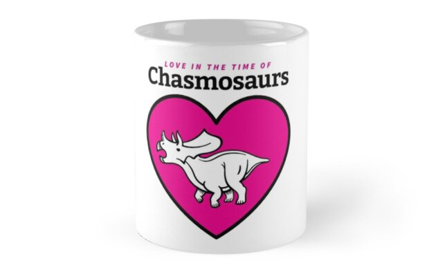
 A beautiful LITC mug! I swear, that's what it is, even though the handle isn't visible.
  A snazzy LITC shirt!
 Thanks for all of the support you've given us over the first five years of LITC, and here's looking forward to many more!


No comments:
Post a Comment